DataFrame Plotting
matplotlib 불러오기, matplotlib 스타일 선택
import matplotlib.pyplot as plt
print(plt.style.available)
plt.style.use('ggplot')
참고 : https://matplotlib.org/stable/plot_types/index.html
Plot types — Matplotlib 3.8.1 documentation
Plot types Overview of many common plotting commands provided by Matplotlib. See the gallery for more examples and the tutorials page for longer examples. Pairwise data Plots of pairwise \((x, y)\), tabular \((var\_0, \cdots, var\_n)\), and functional \(f(
matplotlib.org
sample data 생성
a = np.random.normal(0,1,999)
b = np.random.normal(1,2,999)
c = np.random.normal(2,3,999)
df = pd.DataFrame([a,b,c]).T
df.columns =['A', 'B', 'C']
선 도표
df1 = df.cumsum()
ax = df1.plot()

ax.set_title('Title')
ax.set_xlabel('X Axis')
ax.set_ylabel('Y Axis')

fig = ax.figure
fig.set_size_inches(8, 3)
fig.tight_layout(pad=1)
fig.savefig('filename.png', dpi=125)

plt.close()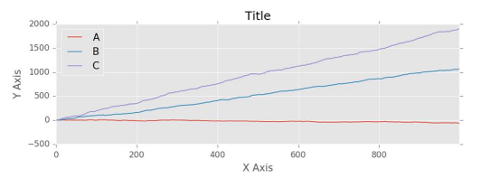
박스 플롯
ax = df.plot.box(vert=False)
ax = df.plot.box(column='c1', by='c2')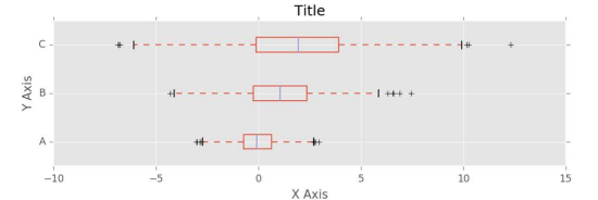
히스토그램
ax = df['A'].plot.hist(bins=20)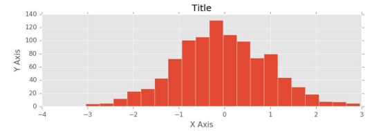
여러 히스토그램(중복 또는 누적)
ax = df.plot.hist(bins=25, alpha=0.5) # or
ax = df.plot.hist(bins=25, stacked=True)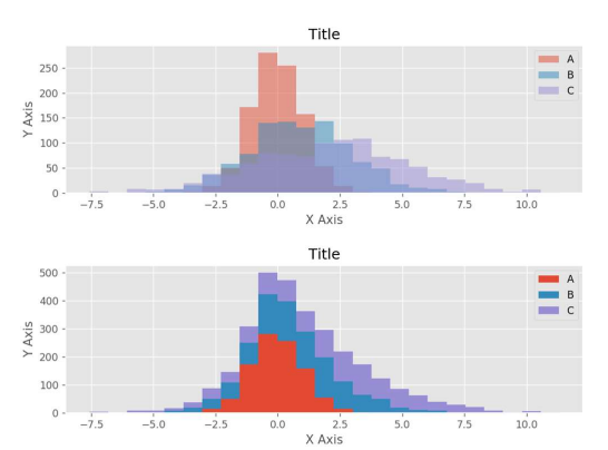
막대 그래프
bins = np.linspace(-10,15,26)
binned = pd.DataFrame()
for x in df.columns:
	 y=pd.cut(df[x],bins,labels=bins[:-1])
	 y=y.value_counts().sort_index()
 binned = pd.concat([binned,y],axis=1)
binned.index = binned.index.astype(float)
binned.index += (np.diff(bins) / 2.0)
ax = binned.plot.bar(stacked=False,
	 width=0.8) # for bar width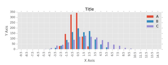
수평 막대
ax = binned['A'][(binned.index >= -4) &
 	(binned.index <= 4)].plot.barh()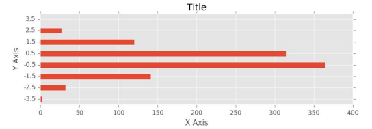
밀도 플롯(Density plot)
ax = df.plot.kde()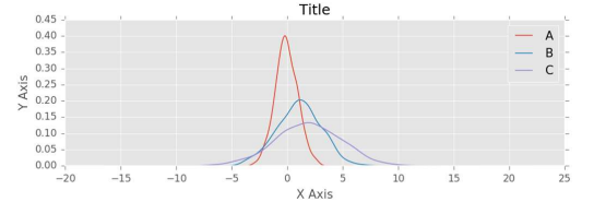
산포도(Scatter plot)
ax = df.plot.scatter(x='A', y='C')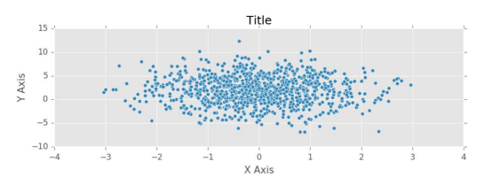
파이 차트
s = pd.Series(data=[10, 20, 30],
 index = ['dogs', 'cats', 'birds'])
ax = s.plot.pie(autopct='%.1f')

ax.set_title('Pie Chart')
ax.set_aspect(1)
ax.set_ylabel('') # remove default

fig = ax.figure
fig.set_size_inches(8, 3)
fig.savefig('filename.png', dpi=125)

plt.close(fig)
표시된 범위(range) 변경
ax.set_xlim([-5, 5])
# for some white space on the chart

lower, upper = ax.get_ylim()
ax.set_ylim([lower-1, upper+1])
차트에 각주(footnote) 추가
# after the fig.tight_layout(pad=1) above

fig.text(0.99, 0.01, 'Footnote',
     ha='right', va='bottom',
     fontsize='x-small',
     fontstyle='italic', color='#999999')
같은 차트에 있는 선과 막대
# start with sample data
s = pd.Series(np.random.normal(
	 1.02, 0.015, 40))
s = s.cumprod()
dfg = (pd.concat([s / s.shift(1),
 	s / s.shift(4)], axis=1) * 100) - 100
dfg.columns = ['Quarter', 'Annual']
dfg.index = pd.period_range('2010-Q1',
 	periods=len(dfg), freq='Q')

# reindex with integers from 0; keep old
old = dfg.index
dfg.index = range(len(dfg))

# plot the line from pandas
ax = dfg['Annual'].plot(color='blue',
	 label='Year/Year Growth')

# plot the bars from pandas
dfg['Quarter'].plot.bar(ax=ax,
 	label='Q/Q Growth', width=0.8)

# relabel the x-axis more appropriately
ticks = dfg.index[((dfg.index+0)%4)==0]
labs = pd.Series(old[ticks]).astype(str)
ax.set_xticks(ticks)
ax.set_xticklabels(labs.str.replace('Q',
 	'\nQ'), rotation=0)

# fix the range of the x-axis … skip 1st
ax.set_xlim([0.5,len(dfg)-0.5])

# add the legend
l=ax.legend(loc='best',fontsize='small')

ax.set_title('Fake Growth Data')
ax.set_xlabel('Quarter')
ax.set_ylabel('Per cent')
fig = ax.figure
fig.set_size_inches(8, 3)
fig.tight_layout(pad=1)
fig.savefig('filename.png', dpi=125)

plt.close()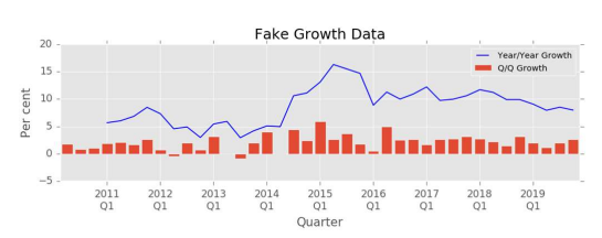
참고 : https://www.geeksforgeeks.org/pandas-cheat-sheet
Pandas Cheat Sheet for Data Science in Python
This cheat sheet provides a quick reference to the most common Pandas commands, covering everything from data loading and manipulation to plotting and visualization. Whether you're a beginner or a seasoned data scientist, this cheat sheet is a valuable res
www.geeksforgeeks.org
'Python' 카테고리의 다른 글
| python 판다스(pandas) DataFrame categorical 범주형 데이터 작업 (10) | 2023.11.18 |
|---|---|
| python 판다스(pandas) DataFrame 결측치 확인 및 처리 (6) | 2023.11.18 |
| python 판다스(pandas) 소개 및 기능 (0) | 2023.11.12 |
| python 판다스(pandas) DataFrame 합치기 merge joining groupby 작업 (0) | 2023.11.12 |
| python 판다스(pandas) DataFrame 셀 cells 작업 (2) | 2023.11.12 |


